Dartmouth Now

Screenshot from Dartmouth Now

With the rapid growth of the digital environment, a difficult task facing many organizations is to consolidate information that is currently spread far and wide so that users do not have to jump from place to place to get a complete picture. Dartmouth Now is one such effort, sponsored by Dartmouth’s Office of Public Affairs.

Before Dartmouth Now, the Office of Public Affairs (OPA) had multiple vehicles for getting the word out about Dartmouth, both in print and online. While leading a College-wide initiative to reduce print publications, OPA took the opportunity to develop a consolidated digital publication for Dartmouth stories. Dartmouth Now is Dartmouth’s primary information destination for current activities and initiatives.

My role in Dartmouth Now was primarily strategic. As project manager, I worked with OPA and Web Services colleagues to develop a project charter and timeline for the website, and to keep the project moving.

But I also had the opportunity to work with code. One of the project requirements was a software platform that would support comments, tagging, easy updating, and an approval workflow. We decided to use WordPress as the development platform. This was Web Services’ first foray into using WordPress. I joined the team in tinkering with the templates and CSS to help accomplish the design and functionality.

In addition, Dartmouth Now offers email updates via MailChimp. I designed the email template using MailChimp’s RSS-to-Email feature. Updates are automatically generated from Dartmouth Now’s RSS feed and sent to subscribers daily or weekly, depending on their preference.

Screenshot of Dartmouth Now email update
The Dartmouth Now email update is delivered using MailChimp’s RSS-to-Email functionality.

Dartmouth Home

Screenshot of Dartmouth homepage

In my time at Dartmouth I have been responsible for three homepage designs. For the most recent version, launched in August of 2006, I collaborated with colleagues in the Office of Public Affairs. We formed a working group called The HomeTeam, established oversight with senior leadership of the College, and embarked on six months of user research, followed by two months of informed design.

We decided early on that we did not want to “tell and sell” Dartmouth. Effectively representing Dartmouth online could not be achieved through static, official narrative. Instead we sought ways to “show” the Dartmouth Experience. We opted to use the site as a news source, highlighting the “now” of Dartmouth through stories, events, and features. While the Dartmouth homepage requires daily care and feeding, it serves an important role in representing the vibrancy of the College, both internally and to the world at large.

Another thing we recognized early on was that the success of the site depended on engaging the Dartmouth community in the design process. People at Dartmouth use the homepage as their portal to information, activities, and tools that are part of their work. If the homepage did not serve their needs, we would be introducing a frustration into their daily lives.

Screenshot of Customize Quicklinks page
The Dartmouth homepage allows users to create a custom set of QuickLinks on the home page, providing easy access to commonly used website and applications.

We spent a good deal of time talking to the community about their needs, checking in through Web Town Meetings to share design ideas and gather feedback, and posting our work and progress and requesting feedback through the HomeTeam website.

For the design, we used a flexible, three-column layout with a full-width photo at the top of the page, similar to a newspaper layout. The widescreen aspect of the photos can be challenging, but the College photographer has a wonderful eye for wide shots.

As of this writing, the design we launched in 2006 is still Dartmouth’s homepage. Five years is an eternity on the web, with its shifting design trends. While I expect a redesign within the next year or so, the current design still serves Dartmouth well, thanks in large part to the good work of its editors who keep the content and images fresh and interesting.

Access by Design

Access by Design book cover

My work as a web designer became more meaningful when I became involved with web accessibility. I found using design to address issues facing people with disabilities more rewarding than focusing on aesthetic concerns of flash and visual impact. And in learning more about universal design in other disciplines, I learned that accessibility and good design go hand in hand.

When I first became aware of web accessibility much of the attention  was in the form of guidelines and best practices. I was interested in integrating accessibility into design rather than considering it as an afterthought or as part of a validation process. All too often, accessibility is brought to the table at the end of the design cycle.

Usability through user-centered design was also gaining a foothold in the years leading up to Access by Design. Slowly but surely, design requirements for web sites and applications were being defined by user needs rather than the preferences of those making design (or business) decisions.

Access by Design integrates concerns for usability, accessibility, and universal design into a design methodology—universal usability. Human-computer interaction pioneer Ben Shneiderman defines universal usability as “enabling all citizens to succeed using communication and information technology in their tasks.” My goal in writing Access by Design was to provide practicing user experience professionals with a toolkit for achieving universal usability on the web.

As with Web Style Guide, the complete text and illustrations from Access by Design is online, along with additional resources to support further exploration and understanding.

New York Times article on web accessibility

Photo from office window with brick wall obstructing the view
The view from the window in my old office, obstructed by a free-standing brick wall


In the spring of 2002 I had an idea for an article. For several years I had inhabited an office in Berry Library at Dartmouth College. The office was nice—large window, high ceiling, new construction. But outside the window was a brick freestanding wall that obstructed my view. I tried not to let it rankle me, but every time I had a visitor she or he would make some comment like, “Nice view.” Thanks.

I heard through some source that the wall had to be that height—something to do with the golden ratio and classic proportions. But the reality is that every window on the first floor of the north facing side of the building looks out on brick instead of the beautiful New Hampshire landscape. And to top it off, the wall is purely aesthetic—it has no structural purpose.

At the time I was getting more involved in web accessibility. I found myself arguing against elements, such as Flash and dropdown menus, that were unnecessary and could potentially create barriers.

That’s when I finally found a purpose for the wall outside my window. I could use it as an illustration of how design decisions can result in unnecessary barriers. No one who visited my office ever praised the wall or saw its value despite the drawbacks. If I created a parallel using this unnecessary and obstructive wall, perhaps people would arrive at the same conclusion about barriers on the web.

The idea had traction. I wrote a rough draft and pitched it to an editor at the New York Times who had given Web Style Guide a favorable review. She connected me with the editor of the New Economy column and I was off to the races. The article, New Economy; Eye-popping graphics can spice up Web sites, but they also create barriers, was published in paper and online on June 10, 2002.

This article is one of my proudest accomplishments. The writing came together nicely and went out to a broad readership. I was able to raise awareness of the barriers facing people with disabilities at a time when web accessibility concerns were not well or widely understood.
Web Style Guide

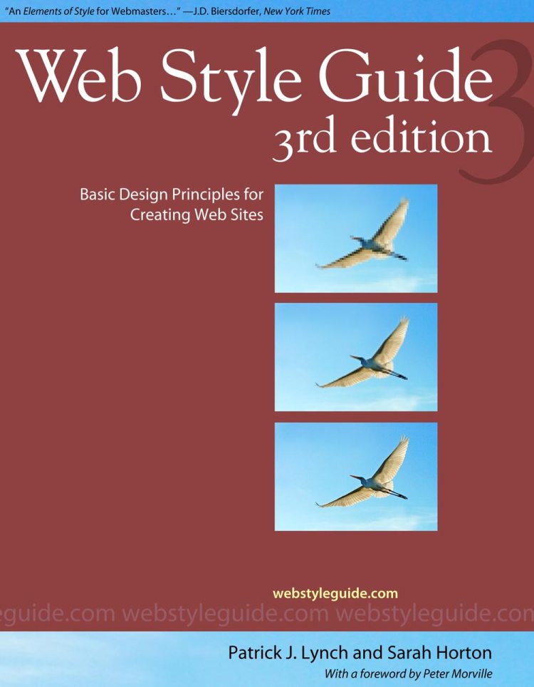
Web Style Guide book cover

The first version of Web Style Guide was a web site called the Yale C/AIM Web Style Guide, posted in 1993, just as the world outside computing and academia began to notice the new medium and the Internet in general. The early web was sorely lacking in aesthetics but exploding with potential. Web Style Guide provided much-needed guidance on structure and design based on several decades’ worth of experience with print, hypermedia, and multimedia design and authoring.

In 1997 my co-author, Patrick Lynch, and I updated the Web Style Guide site to reflect the maturing design trends and changes in web technology. This was a time of significant progress in visual design and interface sophistication, but at the cost of standardization and accessibility.

In 1999 we produced the first print edition of Web Style Guide. The web site had gained a significant following as more and more organizations turned to the web as their primary means of communication. People with little or no background in design were assigned the responsibility for web site development, and they looked to Web Style Guide for calm, reassuring, and practical guidance.

Since its inception as a web site in 1993 and into its third edition, Web Style Guide has presented solid design advice based on classic design principles.  In the second edition we focused on solid design practices, acknowledging the growing attention to web standards and accessibility. In the third edition we were able to move away from issues like cross-platform compatibility and adaptation for people with disabilities, and instead provide solid planning, design, and editorial guidance for a more stable, accessible, and sustainable web site.

Web Style Guide is a classic. It has been translated into more than eight languages, and is commonly used as a course text for web design classes. Despite the availability of a book version of the guide, we deliberately chose to continue to make the web site materials freely available.

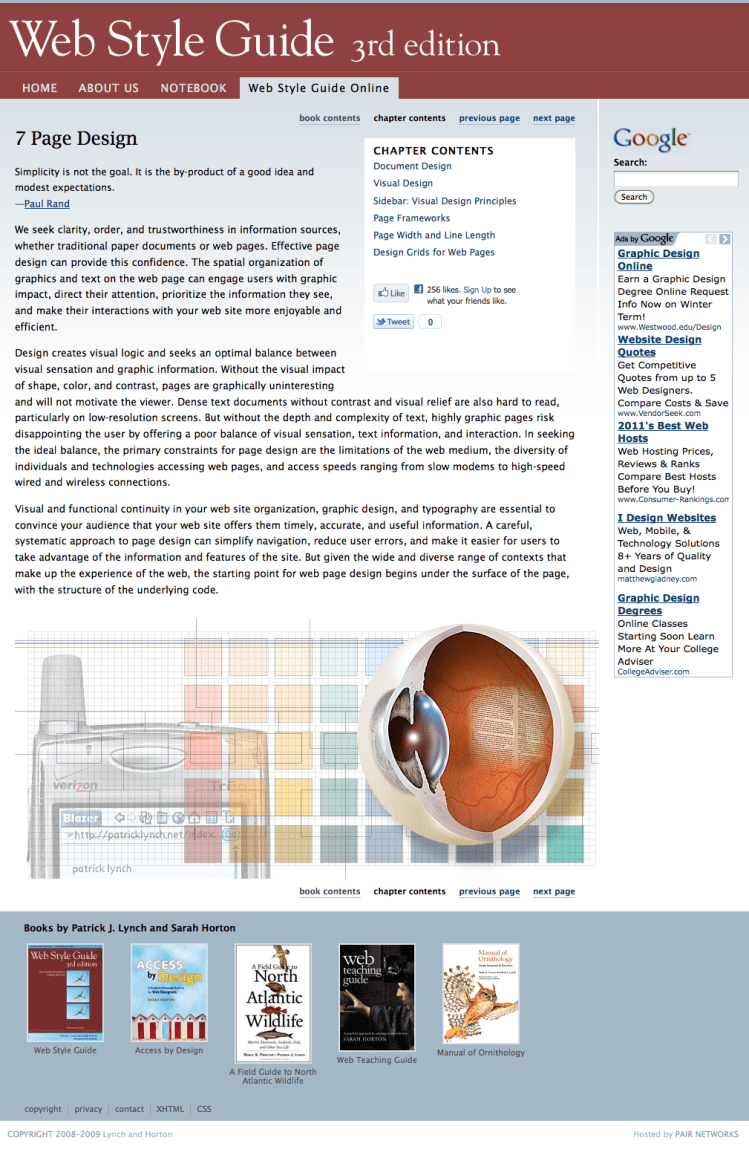
Screenshot of Web Style Guide page

“A style guide for the interface with real long-run value, showing us deep principles of design rather than simply fashion and technology.”
—Edward R. Tufte

“An Elements of Style for Webmasters.”
—J. D. Biersdorfer, New York Times, Circuits Section

“At last a book on the design of web sites with the viewer in mind. Non-technical, yet informative and lively: it delights as it informs.”
—Donald A. Norman, The Nielsen Norman Group

Hopkins Center for the Arts

Hopkins Center for the Arts home page

The Hopkins Center provides an environment for learning about, creating, and experiencing the arts for both the Dartmouth and Upper Valley communities. For their latest redesign, the Hop worked with in-house web support to build a dynamic website that would both promote their programs and serve as a resource for prospective and current Dartmouth students.

The Hop had been working with an external vendor and using a content management system. They had the necessary experience and staffing to commit to maintaining a dynamic website. And since their design and functional requirements included elements such as a calendar and RSS feeds, we decided to use WordPress as the development platform. We normally do not offer WordPress because of the support implications. However, due to the unique business needs of the Hop, we felt a dynamic authoring environment was necessary to meet their needs. We beefed up our in-house expertise and hired an external WordPress consultant to help with the more complex functionality, such as the calendar.

We worked closely with the Hop to develop the information architecture for the site. Our goal was to provide easy and intuitive access to program information, which is necessary for a center for the arts. We also sought to highlight the educational opportunities for Dartmouth students through workshops, exhibitions, and academic programs.

When it came time to work on the visual design, I was fortunate to have access to the graphics developed by the Hop creative team as part of their print campaign. The Hop season brochure provided excellent source materials that allowed me to create a compelling visual design that captured the tone and energy of their printed pieces. In particular, I was able to include a treatment for silhouetted images.

Screenshot of Khmer Arts Ensemble page with silhouette

I used CSS3 transparency effects to maximize the impact of the bold background graphic. In addition, I created a design for the Hop’s YouTube channel utilizing many of the same elements.

Screenshot of the Hop's YouTube channel

The Hop staff was quick to learn the WordPress interface. Once we developed the framework, design, and functionality, the Hop set to work filling out the content, adding text, photos, and videos. WordPress has proven to be a good fit, and they continue to provide site visitors with fresh and compelling content.

Undergraduate Admissions

Screenshot of Dartmouth Admissions home page

As Dartmouth’s Web Director, my responsibility is to manage and coordinate all development of Dartmouth’s digital environment. Admissions is an important property in that environment. When it came time for a redesign, I persuaded Admissions to work with my in-house group, Web Services, rather than outsource the project.

Having won Admissions as a client over external vendors, I was under pressure to deliver a service that would be comparable. However, because of my broader role at Dartmouth, I had to develop the site within the greater context of the Dartmouth web. The entire process required that I perform a careful balancing act of responding to requests while adhering to institutional standards and meeting user needs.

When it comes time for decision-making in the design process, I have found the best approach is to let users drive the process. User-centered design takes the decision making out of the hands of the designers and stakeholders, and instead allows user needs and preference direct decision-making.

We started the process with usability testing of a range of admissions sites at other institutions. We wanted to see how prospective students approach the process of finding a good match in very different contexts.

In observing about 5–6 high school students it became clear that the process of finding a good school was very similar to that of finding a good partner. Prospective students first determine whether they are right for the school by looking for data, such as average test scores of admitted students. If they pass the “fittedness” test, then they explore whether the school is right for them—the location, whether it offers a major in their field of interest, athletics and arts offerings. If the school passes the test, then they look to the application process.

As a result, our strategy was to provide prospective students and parents with data right up front. The current site has “Facts” front and center, complemented by images, videos, narrative, and stories that demonstrate that Dartmouth students are admitted for more than their ability to do well on standardized tests.

The information design supports the natural process flow, with the “Facts” and “Learn” sections providing ample opportunities for prospective students to determine whether they are right for Dartmouth, and whether Dartmouth right for them. The “Visit” section supports the next phase in the process, providing information and opportunities for both virtual and physical campus visits. And the “Apply” section is the final step in the process, with information and functionality to support prospectives who have decided to take the plunge and become applicants. In April, when decisions have been made and applicants have been notified, the architecture also supports admitted students with a “Class of 20XX” section. The site also has an “Answers” section that answers commonly asked questions.

Supporting these more practical needs is the “Perspectives” section. Here is where we attempt to communicate the richness of the study body through a variety of first-hand perspectives on the Dartmouth experience, through interviews, student blogs, live office hours, and more. This section aims to accomplish a challenging task: to provide authentic stories within the context of an official admissions website. We continually explore which means of communication is the most useful, impactful and, most importantly, credible to prospective students.

Screenshot of Dartmouth Experiences page

The visual design is modeled on a flexible, grid-based layout. I generally build flexible, or “liquid,” layouts, but this was the first time I did so on a grid, and the result provides the best of both worlds. The page elements harmonize, and yet they scale to accommodate different window widths and text sizes. And the line length cannot become too long since the layout is restricted to a generous but readable maximum width.

All of Dartmouth’s sites are built on the same codebase, so the Admissions site uses mostly the same code as, for example, Classics, Budget, and the Office of the President. This architecture allows for site-wide changes, such as the inclusion of an emergency banner on all sites in case of an emergency. It also allows a small team of web professionals to provide support to all Dartmouth departments and programs. On the down side, it limits design options.

For Undergraduate Admissions, I used the standard codebase with only one modification — the header area contains additional elements. I made extensive use of CSS3 properties, including color transparency, transition effects, and radius properties. Since not all browsers support CSS3, I coded these elements to degrade gracefully in browsers that do not provide CSS3 support. I also used JavaScript and the JQuery library to enhance the navigation experience, but users who visit the site without JavaScript have fully functional navigation.

Forever New: A Ten Year Report

Screenshot of Ten Year Report webpage

During his tenure as Dartmouth’s President, James Wright produced a both a five- and ten-year report detailing activities and milestones achieved, and plans for the future. I developed websites for both reports. My task was to take the lovely print design created by my colleagues in the Office of Public Affairs and turn it into an attractive and easy to navigate website.

In many ways, web design is more difficult than print design because the medium is fluid rather than fixed on paper. Designers often address this difficulty by trying to nail designs down using fixed element widths, fixed type sizes, and unchangeable graphics. However, as a designer I strive for universal usability. I design layouts that adapt gracefully to different window widths and types sizes, and favor text over graphics whenever possible, as text can be read by software and graphics cannot.

The ten-year report challenged my abilities at fluid design. The booklet is image heavy, with compelling photographs bleeding to the edges of most pages. With a flexible web page, it’s impossible to predict page edges. I used floats, fades, and clipping to capture some of the same drama as bleeds.

Screenshot of the Ochieng’ Brothers page showing treatment of large images

The navigation of the site is modeled on the booklet, with linear paging links that announce the topic of the next page. Paging navigation is both above the fold and at the end of each narrative, so users can easily page through the report. To accommodate users who wish to jump from section to section, or among specific pages within each section, I included a site map on the home page and at the bottom of each page.

Regardless of the ease of use, attractiveness, and readability of the on-screen version, some users would prefer to print the report. I explored options for producing an attractive and readable printed version, using image swapping to provide high-resolution print-friendly images where possible. I also provide a link to a single-page version for printing. While the printed web version is not the equivalent of the one designed by my colleagues, it provides a good experience, both on screen and on paper.